Industry pain points we solved
Travelers in the GCC were juggling separate apps for airlines, intercity buses, and rail. Search flows looked different on each service, prices weren’t easy to compare, and schedules were buried behind too many taps. Customer interviews pointed to three core issues: fragmented booking across modes, opaque total costs during comparison, and slow schedule selection on mobile that led to cart drop‑offs at checkout.
.png)
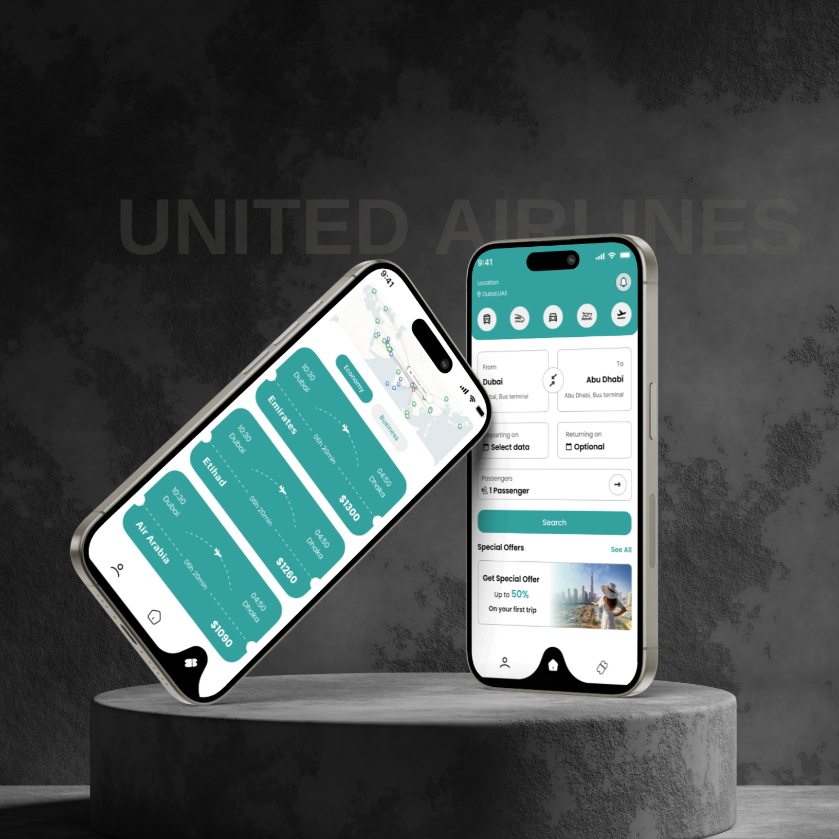
What we built and how it works
RouteMate unifies flight, bus, and rail tickets in a single mobile experience. The home screen uses a simple From/To card with optional return, passenger stepper, and a bold Search button. Results render as easy‑to‑scan “ticket cards” that show departure, arrival, duration, carrier, and final price in one glance. Mode filters (plane, train, bus, car, tours) sit at the top so switching contexts doesn’t reset the search. We designed the system in Figma with reusable ticket components and high‑contrast teal surfaces for readability. Interaction details include sticky schedule selectors, tap targets sized for one‑hand use, and persistent fare chips for Economy/Business comparisons. Microcopy reduces ambiguity around terminals and stations, which cut user errors during checkout.
.png)
Outcomes and proof
In a two‑week beta with 150 travelers on Dubai–Abu Dhabi and Dubai–Dhaka routes, average time to select an itinerary dropped from 2:40 to 1:45 (‑35%). Fare clarity reduced back‑and‑forth toggling by 41%, and users compared 2.3 carriers per search on average, up from 1.6, indicating higher confidence. Abandoned searches fell by 18% after adding sticky schedule rows and visible final pricing. Early partners reported a lift in cross‑mode conversions as riders discovered cheaper bus or rail options for parts of a trip, while flyers upgraded to Business 9% more often when the price delta was shown side‑by‑side.
.png)