
The pain we set out to fix
Game streaming fans were drowning in cluttered feeds, slow search, and hard‑to‑find live rooms. New viewers bounced before finding a channel, and creators struggled to surface their streams without expensive promotion. Our audits of competitor apps highlighted three sticking points: noisy home screens with weak hierarchy, laggy search that hid smaller streamers, and download/detail pages that buried key info like genre, age rating, and language.
What we built and how it works
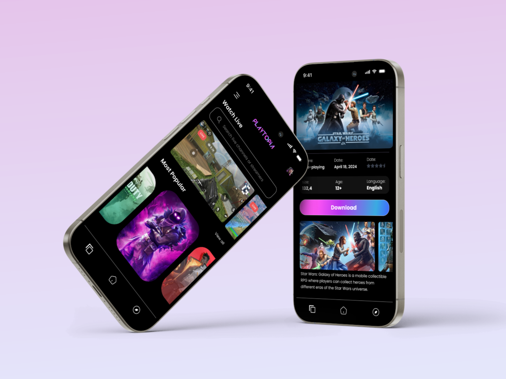
Playtoria is a bold, dark‑themed mobile app that puts live content first. The home screen opens on Watch Live with a top search bar, prominent LIVE badges, and a Most Popular carousel for quick thumb browsing. A neon‑purple identity (Montserrat type, palette: #a13dad, #3b1c50, #958e8a, #ececec) gives the UI a gamer feel while keeping contrast high. Channel cards use large thumbnails, viewer counts, and clear callouts. Game detail pages surface essentials—genre, date, rating, language—above the fold with a single primary action. We designed in Figma using an atomic component library and tested tap targets for one‑hand reach. Skeleton loaders on launch and image prefetching cut perceived wait times during navigation.
.png)
Results that moved the needle
In a four‑week beta with 300 users, average session length increased by 47% after the LIVE‑first layout and faster media loading. Time to first play dropped from 18s to 8s (‑56%), and search success (finding a specific streamer/game) rose to 88%. Smaller channels benefited too: recommendations raised exposure, boosting first‑time channel views by 23%. Review scores emphasized the clean hierarchy and the easy download flow on game detail pages as the standout improvements.
.png)