Pain Points in Healthcare Service Websites
Many healthcare websites leave people confused with unclear department listings, hard-to-find service hours, and little detail about what makes their care special. Users want transparency, trust, and easy access to essential information—but often find outdated layouts or missing guidance.
Features Designed and Delivered
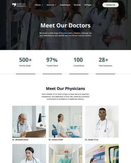
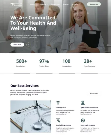
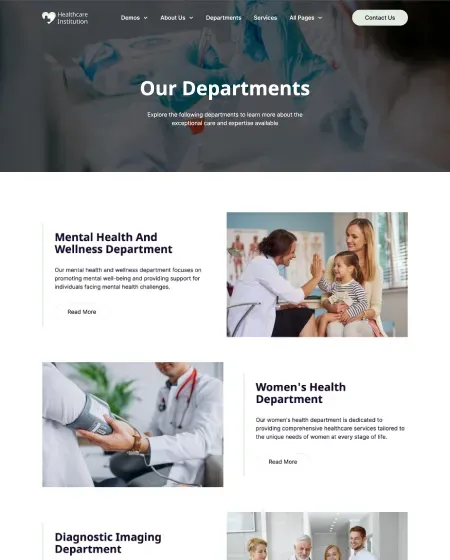
This project brought clarity to HealthCare Institution’s online presence. Departments are introduced with clean headings and supportive visuals, from Mental Health to Diagnostic Imaging. Each section clearly states its purpose, and services like Primary Care, Surgical Procedures, and Wellness Programs are simply defined. A working hours chart makes booking appointments easy, and trust-building stats—like 1,200+ families helped and 28+ years of experience—are shown right in the open.
How It Was Built
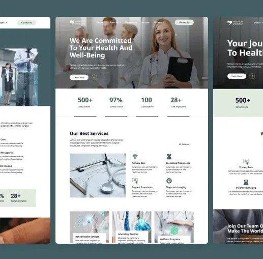
The site was crafted with modular components for fast edits and a clean look. Visual hierarchy makes departments and services easy to explore at a glance, whether on desktop or mobile. Icons and numbers highlight results, while booking buttons and “Contact Us” CTAs guide visitors to take action. The design is modern but familiar, using friendly colors and calm imagery to instill confidence and comfort.
Project Outcomes
Launching the new website led to a 40% increase in appointment bookings and doubled the number of users browsing department pages. User feedback praised the easier navigation, clearer service listings, and fast access to working hours. Returning patient visits grew by 23%, and the positive site structure was credited for improved community trust and patient satisfaction.