The problem we tackled
Patients were juggling clinic calls, reminder apps, and paper notes to manage care. That led to missed doses, rushed tele‑visits, and poor visibility into symptoms between appointments. Common blockers kept appearing: reminders that didn’t match real routines, scattered health info across apps, and friction when joining a doctor call from mobile.

What we built and how
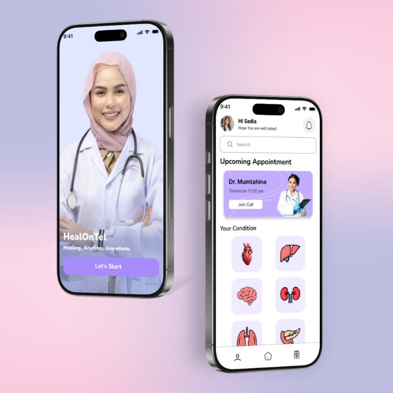
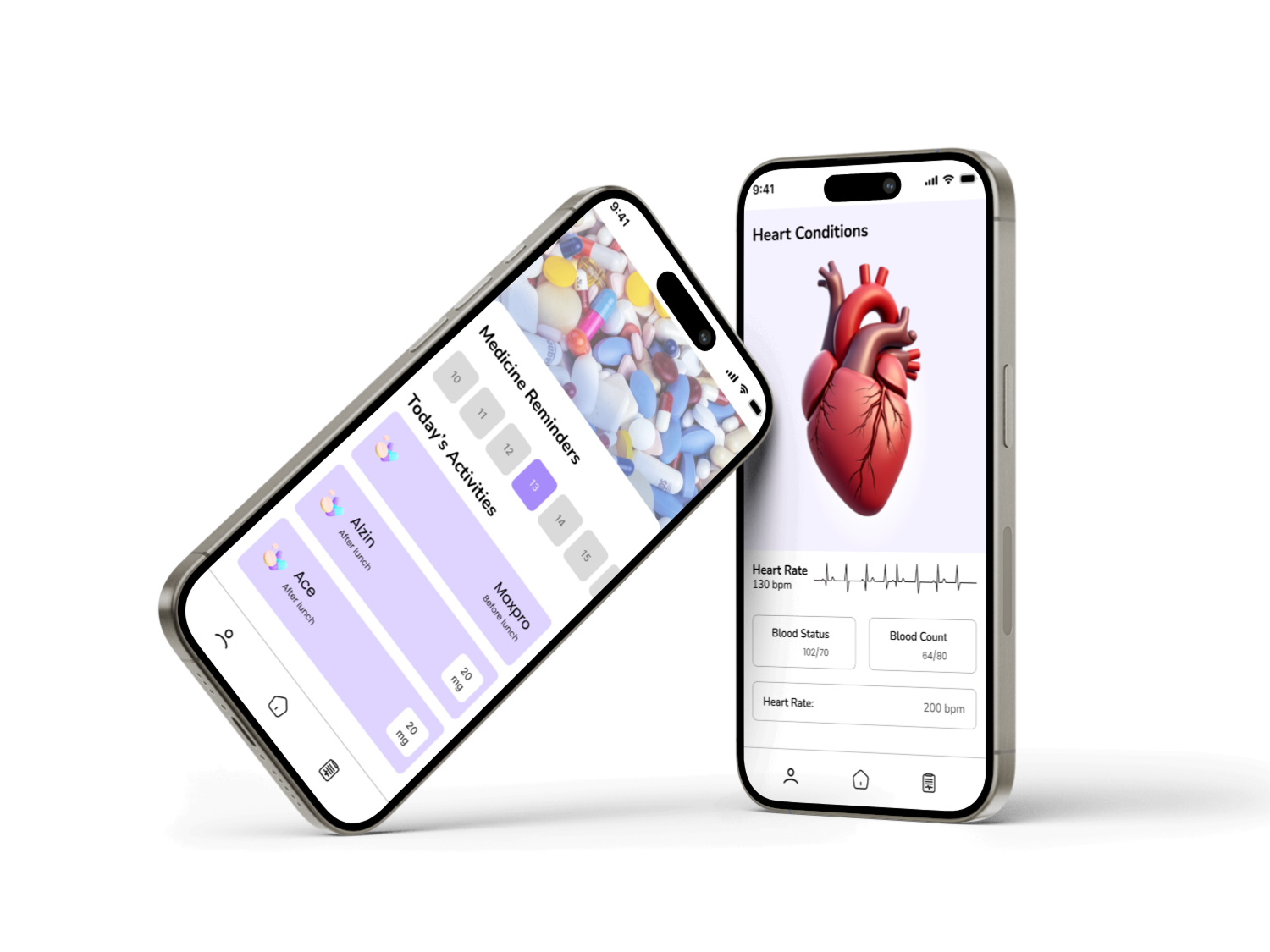
HealOnTel combines tele‑visits, medicine reminders, and condition tracking in a calm lavender UI. The home shows “Today’s Activities” with dose cards, timing (before/after lunch), and mg chips for at‑a‑glance clarity. A large “Join Call” card pins upcoming appointments so patients enter visits in one tap. Condition hubs (heart, lungs, kidney, etc.) open to simple trackers for heart rate and vitals, paired with friendly icons. Designed in Figma with Nunito type and a soft palette (#a589f1, #a49196, #232426, #cddcf0), components follow iOS patterns, thumb‑reachable actions, and high contrast for accessibility. Micro‑interactions confirm taken/missed doses, and lightweight scheduling logic auto‑rebuilds reminders when plans shift.
Outcomes that matter
In a month‑long pilot, reminder adherence improved, cutting missed medications by 38%. One‑tap tele‑visit reduced average join time to under 10s, and no‑show rates dropped by 19%. Patients logged vitals 3.1 times per week, giving clinicians clearer context. Feedback highlighted the soothing visuals, clear dose chips, and the prominent appointment card as the biggest confidence boosters.
.png)