Industry pain points we solved
Clinics and diagnostic centers were drowning in repeated intake forms, scattered PDFs, and patients bouncing between specialists with no single view of their history. People lost lab reports, providers lacked context in appointments, and follow‑ups slipped through the cracks. From onboarding to results review, we found three consistent blockers: redundant data entry at every visit, unorganized medical files across departments, and weak visibility into daily health metrics like blood pressure and glucose that should inform care plans.
What we built and how it works
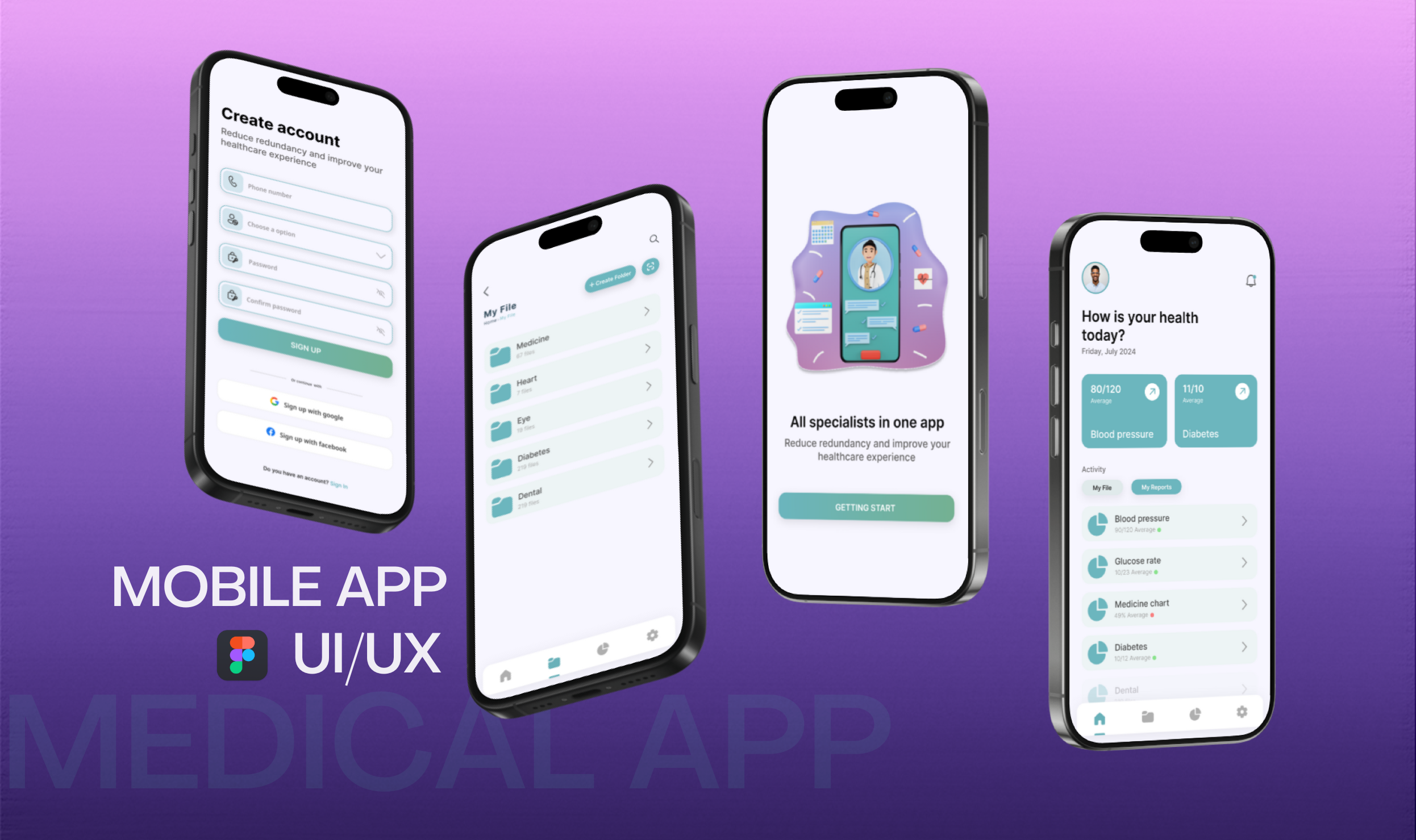
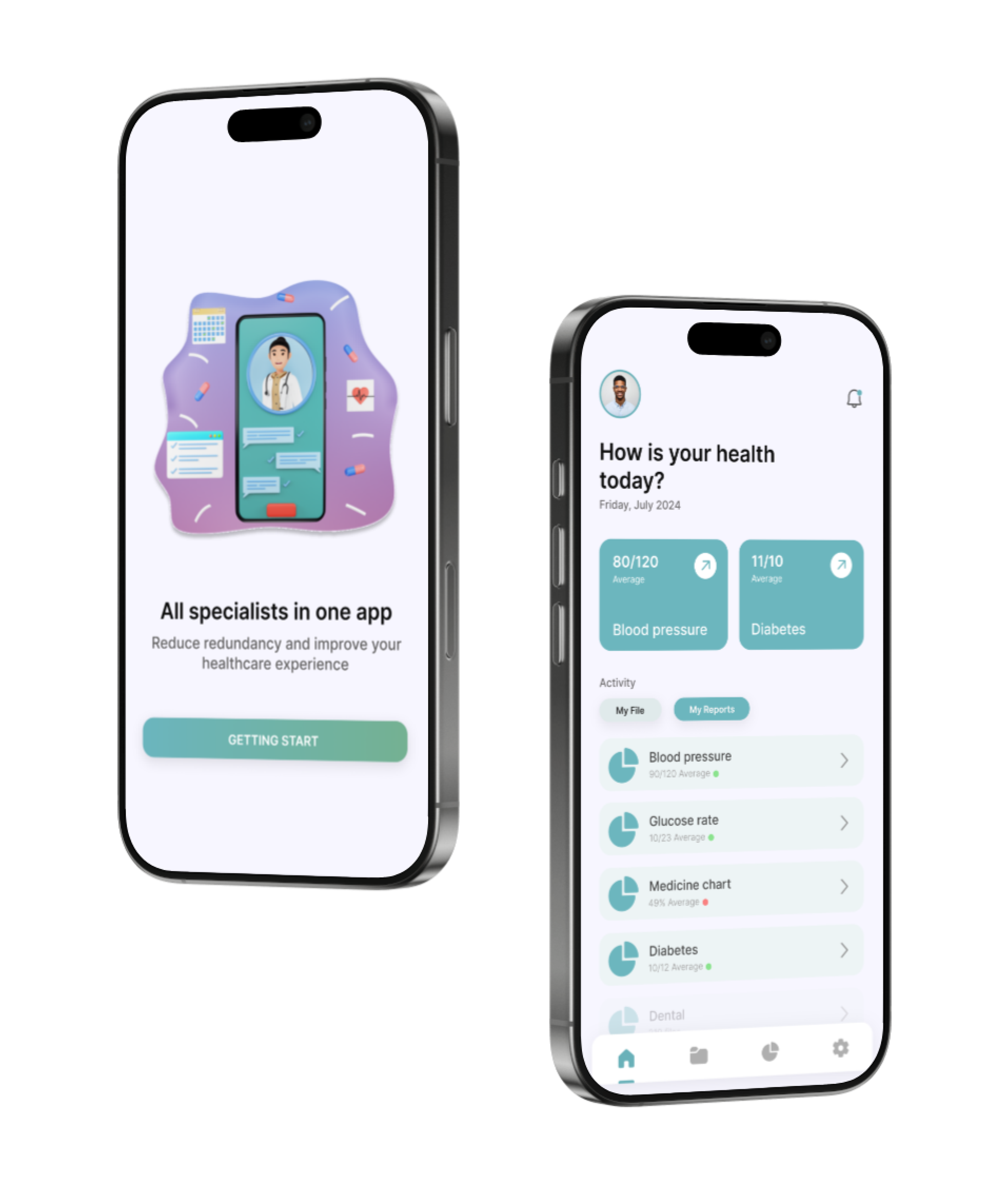
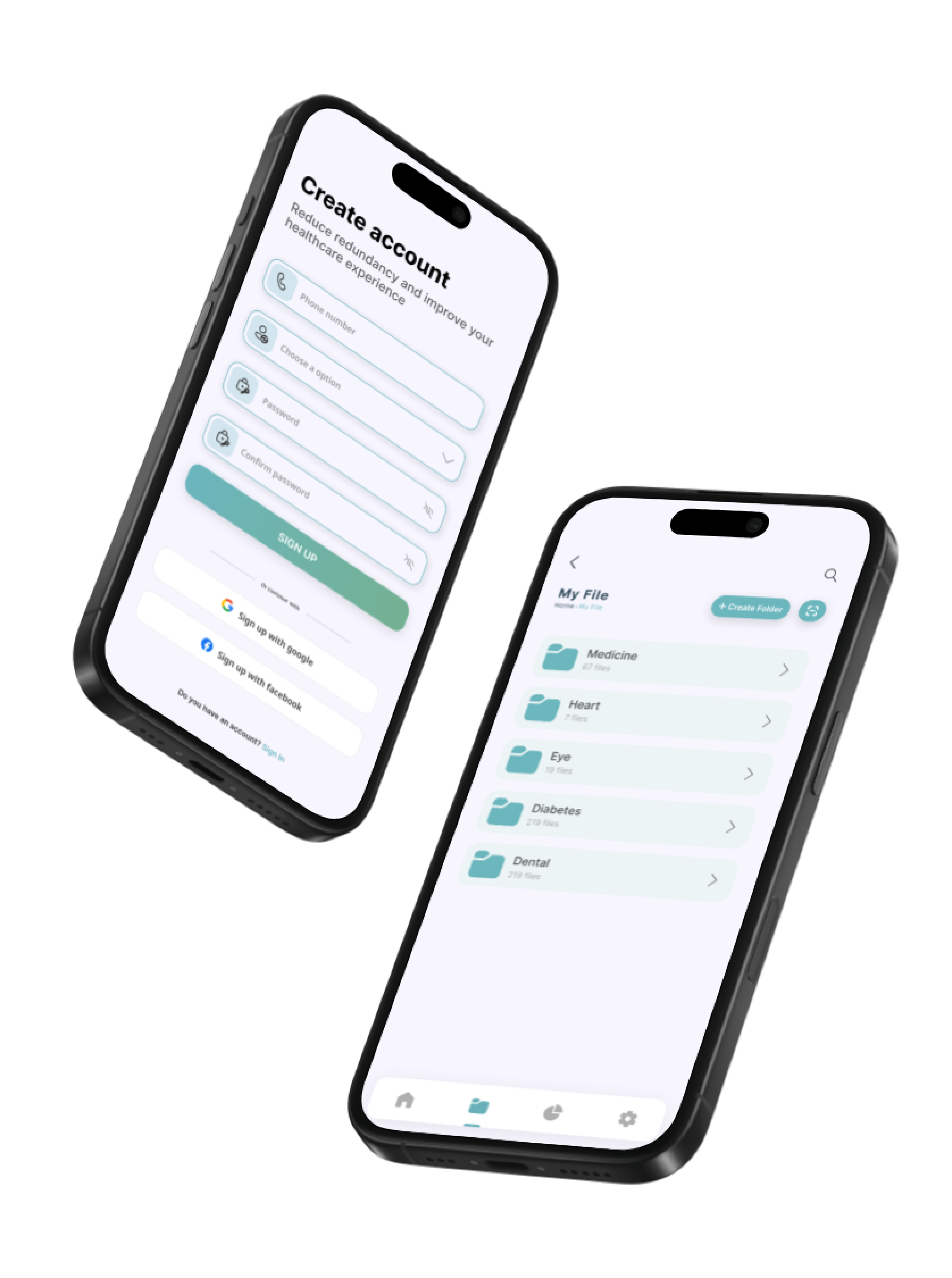
HealHub brings all specialists into one app with a clean mint‑teal UI. Patients create an account in under a minute, then organize records in clear folders (Medicine, Heart, Eye, Diabetes, Dental). A home dashboard surfaces today’s health status with tiles for blood pressure and diabetes, plus quick access to Activities, My File, and My Reports. We designed the system in Figma using atomic components and iOS HIG patterns for familiar navigation. Form fields support phone-based OTP sign‑in and social auth, reducing friction. File management uses consistent card patterns and search, so lab results and prescriptions are easy to find. Metrics cards use high-contrast badges and simple trend cues to help non‑technical users understand changes at a glance.
Outcomes and proof
In pilot testing with two multi‑specialty clinics, average patient check‑in time dropped from 5:00 to 3:00 minutes (‑40%). Repeat data entry fell by 65% thanks to reusable profiles and smart defaults. Record retrieval became instant for 9/10 users, cutting “can’t find my report” incidents during appointments. Clinics reported a 22% rise in completed follow‑up visits after My Reports reminders nudged patients to book care based on new results. Satisfaction scores improved, with users calling out the clear folders and the simple “How is your health today?” dashboard as the biggest wins.