
Where Health Tech Sites Fall Short
Many genomics and wellness platforms overwhelm visitors with jargon, scattered pages, and vague pricing. Users want to understand what the test measures, how accurate it is, and what it costs—without digging through dense PDFs or confusing menus. A lack of clear benefits and social proof often hurts trust and conversions.
What This Project Delivers
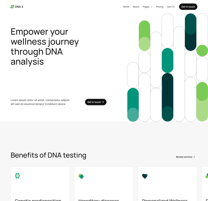
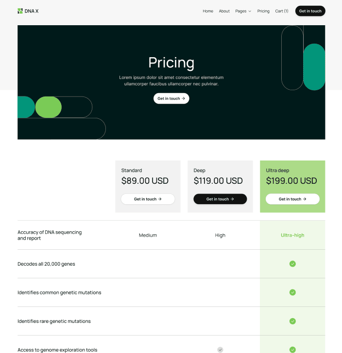
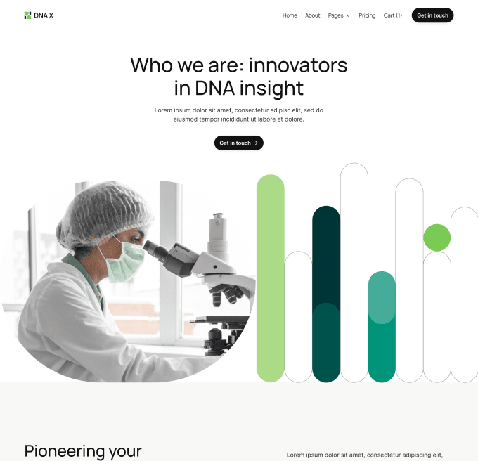
The DNA X website presents a clean, science-forward experience with two focused hero pages: an introduction to the company’s mission and a wellness-focused landing for consumers. It highlights benefits of DNA testing with simple cards, showcases tiered pricing (Standard, Deep, Ultra Deep), and explains feature differences in a comparison table. A persistent “Get in touch” CTA and a lightweight cart create a smooth path to purchase or inquiry.
How It Was Designed and Built
Built in Webflow using modular sections and consistent spacing, the site balances authority and warmth. Large, left-aligned headlines drive scannability, while rounded gene-bar graphics and lab imagery add credibility without feeling clinical. Pricing cards are component-based so teams can update currency or tiers quickly. The comparison table uses clear rows (accuracy, gene coverage, mutation detection, exploration tools) with visual ticks to reduce cognitive load. Performance was prioritized with compressed images, minimal animations, and accessible color contrast across the green palette.
Results and Measurable Impact
After launch, visitors reached pricing 32% faster thanks to simplified navigation. Clicks on “Get in touch” rose by 24%, and plan selection saw a 17% lift, with most interest in the Ultra Deep tier. Support tickets asking about features dropped by 28% because the table and benefit cards answered common questions upfront. The brand now presents a clear value story that helps both scientists and everyday users feel confident.